Novus
Designing a date plan app to find date spots and plan them
Overview
CHALLENGE
THE PROBLEM
USER FLOWS
DESIGN
ITERATION
PROTOTYPE AND TESTING
ITERATIONS
LEARNINGS
Novus is an app for people who want to improve their dates and date planning experience. We all know the feeling of dread when your girlfriend/boyfriend complains about you not planning any dates or the feeling of boredom when all your dates are either seeing a lackluster movie or going to a regular dinner spot.
Create a new user experience for date planning that encourages people to plan more dates through uncovering user pain points and focusing on a simplistic design.
Users were using all sorts of apps to find date spots. - Instagram, Google, Yelp, - but not one app provided everything they needed. It was always a cumbersome and windy journey to the next date.
Talking to these people solidified for me that there needed to be a better solution. I also realized users had different priorities when it came to what they were looking for in a date spot and that was something I really want to make sure I kept in mind throughout the project.
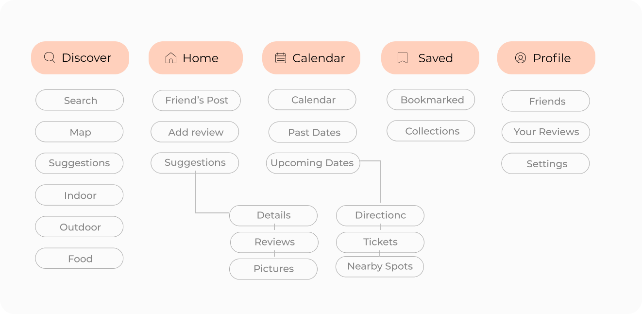
I created a sitemap to keep track of all the screens and help me visualize how they would connect. I brainstormed a few options and finally landed on the 5 primary navigations - discover, home, calendar, saved and profile.
There were other functionalities I wrestled with including but decided against, as I thought back to the goal of the app - to be easily navigable while encouraging couples/people to go on more dates. Any other navigation would complex the app unnecessarily.
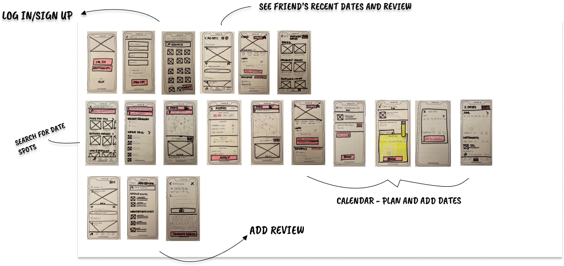
To get some ideas and designs out quickly, I put pen to paper and sketched out some frames. I then tested these sketches through guerrilla testing with 5 users to learn what they liked and found confusing. I wanted to make sure the solutions I came up were intuitive and actually addressed the struggles I discovered during the discovery and synthesize phase.
Overall, I had positive feedback about the design and the users expressed a lot of excitement over the more personalized suggestions and reviews by friends. This confirmed the solution I designed.
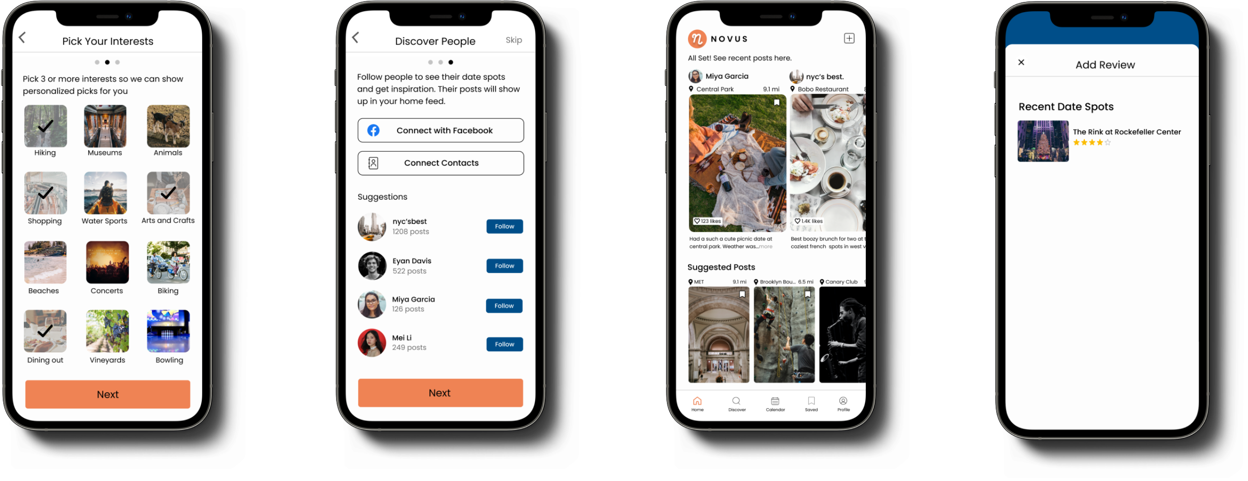
However, I did see confusion surrounding the home page. I needed a better way for people to share their feedback about date spots without it resembling a social media app and taking away from the main purpose of the app.
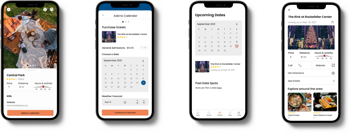
With my hi-fidelity prototype, I conducted usability testing with 5 potential users. I wanted to test the 3 main user flows for the app - browsing and saving interesting date spots, planning a date to a specific spot, and lastly writing a review. Mainly, I wanted to make sure users could complete the tasks without major issues, and note any potential improvements to those flows.
From the usability testing, I got a sense of how someone completely new to the app would use and interact with it, which was a perspective I lost after working on the high-fidelity screens for a couple weeks at this point. So I truly learned to appreciate usability testing and the iterative design process.
Some key takeaways from this project were:
My assumptions were sometimes wrong and what seemed intuitive to me was confusing to users and I had to learn to take a step back and remove my biases.
Time constraints meant I couldn’t work on everything and had to prioritize issues and decide which needed to be address and which needed to be noted for the next iteration.
I couldn’t design for every user. It was a constant battle to not include new ideas/features and I had to remind myself of the initial goal and user groups I was designing this app for.


